Brooklyn General Store
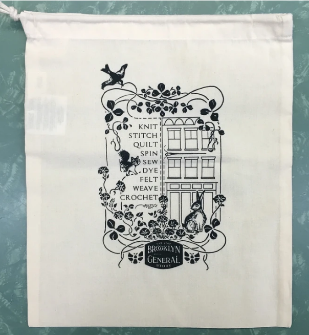
I put myself through design school by working at a boutique craft store in Brooklyn named Brooklyn General Store. The store itself is located in a hundred-year-old building in Carroll Gardens where there used to be a true general store. The business owner has chosen to preserve all of the original woodwork and shelving, and the brand’s visual expression follows the old fashioned theme, as you can see in the examples below.
I’ve had the privelige to work on a variety of projects for Brooklyn General that are very creative, since the team is small and they would otherwise not have the opportunity to work with an in-house designer. The logo was not created by me, and there were certain fonts and other style guidelines associated to the brand that had to be followed, so it was my first time working within a predetermined style. I found that I loved it and paradoxically felt more free when given these restraints.
My first assignment was the repeat pattern featured below, printed on kraft butcher paper and designed to be used as packaging for web orders. Many of the motifs were borrowed from a drawing that the owner did herself years ago that was printed on a drawstring bag sold as a product at the store (left). I used some of these motifs again when designing the “about us” page for the website, to lend consistency to the aesthetic and add a friendly, cozy feeling to the page—much like the store itself.
Sisterly Shawl Pattern Layout
Sisterly is a knitting pattern that Brooklyn General Store owner Catherine Clark designed, and asked for my help with the pattern layout. Conventionally these patterns are sold as a pdf on the popular knitting website Ravelry. There were many technical challenges in this project with spacing, typographical heirarchies, readability, and fitting a lot of information on four pages. The project required extreme attention to detail (something I am great at) when setting the type, and line-by line scanning to make sure that the dense text and abbreviation-heavy knitting language was readable. Each new row in the pattern is bolded and starts on its own line, abbreviations are capitalized, and all stitch counts falling at the end of every row are in parentheses and italicized. There are clickable links that take the knitter straight from the pdf to helpful video tutorials, a chart to help visualize the project if you don’t want to read the pattern line by line, and a chart key. Stylistically, the design evolved from Catherine’s previously released pattern library. I was able to take her style from previous patterns and turn it into an InDesign template that she can use over and over again in the future.
Click here for more examples of knitting pattern layout and other typographic projects!
Sashiko Mending Kit
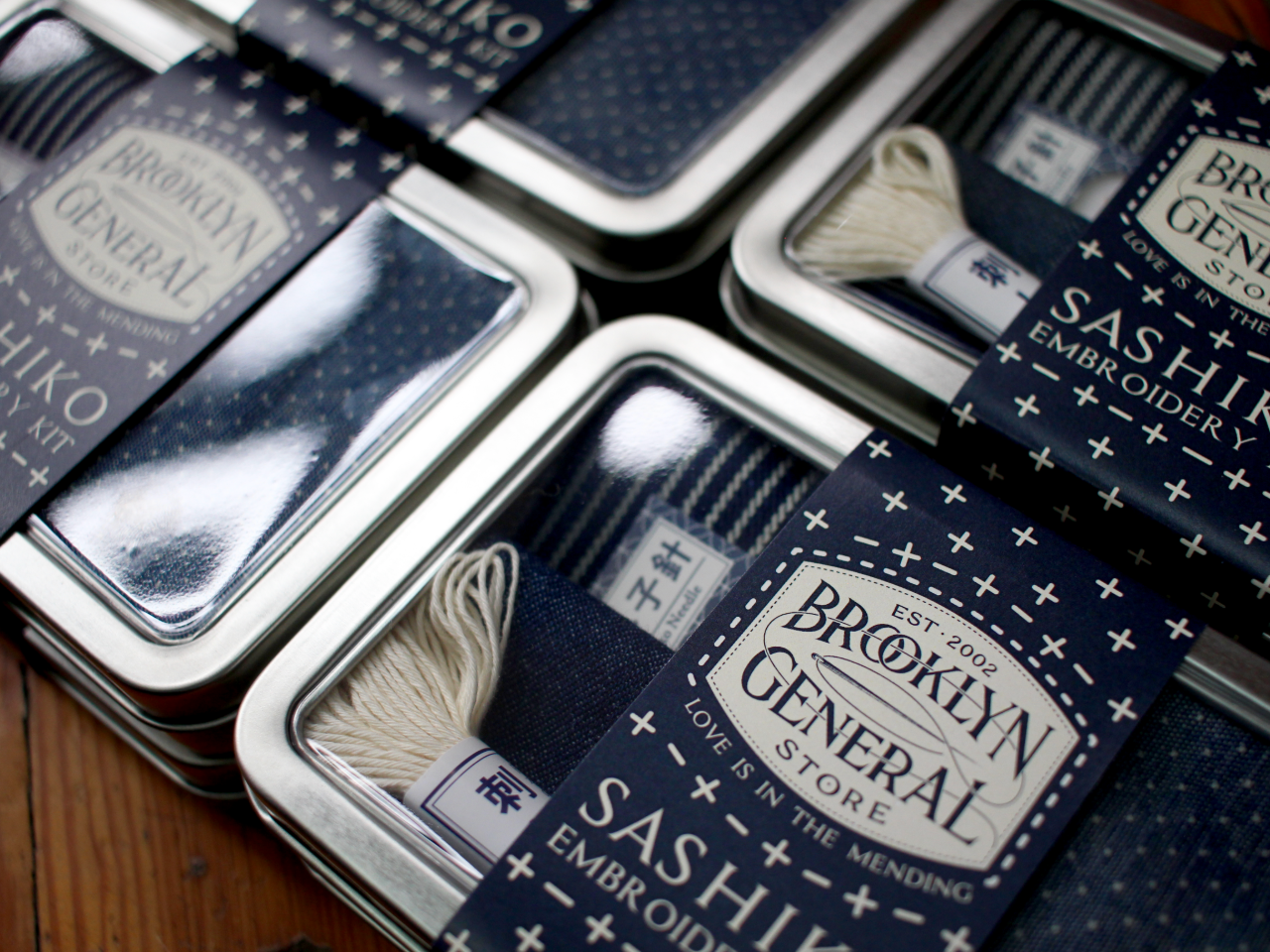
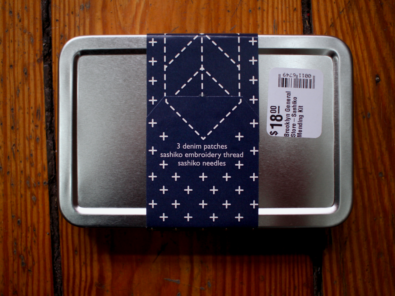
As a lover of good packaging and a crafter myself, this simple and elegant band design was a delight to create and execute. Using the existing logo and required display type, I created a label that not only fit with the aesthetic of the store, but with that of Sashiko embroidery, a craft of Japanese origin featuring intricate geometric patterning intended to make visible and beautify the art of mending. The colors on the label are taken from the contents of the kit itself, while the motifs reflect those of the conventional Sashiko stitches.
Read more about Sashiko embroidery here


