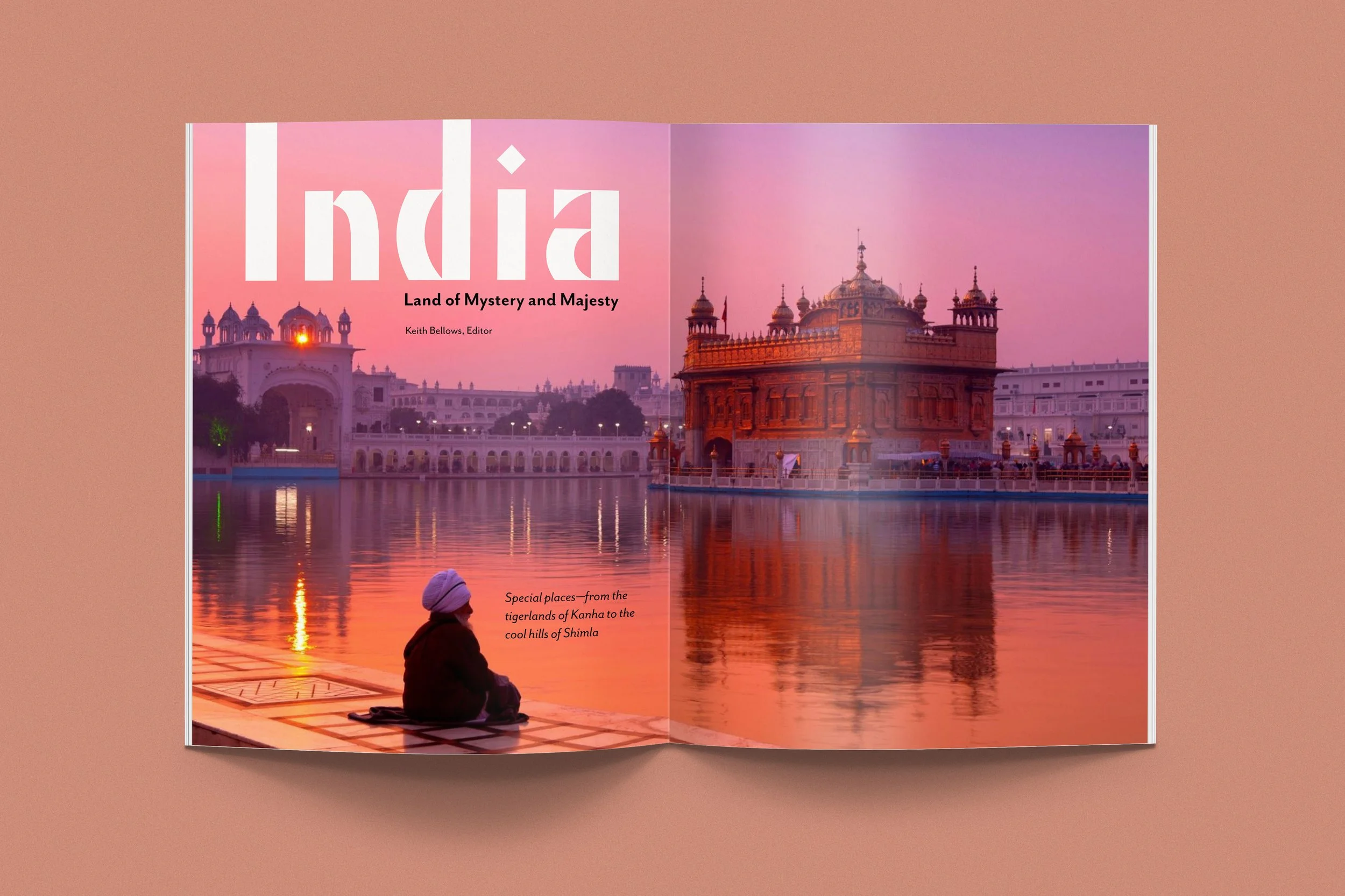
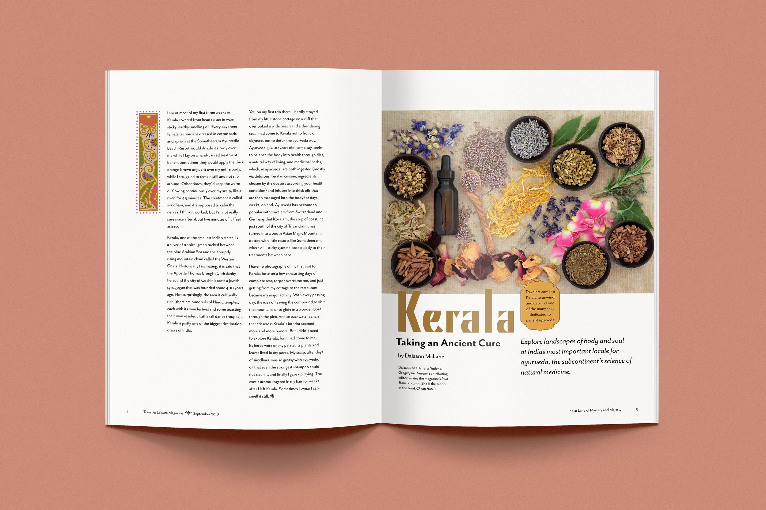
Travel and Leisure Magazine Article
Student Project; Layout & Typography, Illustration & Lettering
This magazine article was an early project for me, and I have learned a lot in the time since it was originally designed. I created hand-drawn drop cap illustrations for this that I’m very proud of, and I think the display font choice was a success, in addition to the images sourced. The concept for this layout was that there would be a feeling of movement to the spreads and I feel like that is accomplished, but in the years since this project’s inception I have lost the desire to try and break the mold as it were. If I were to do this project again, I would concentrate on making my layouts match each other more and stick to a typographic grid, while letting the drop cap illustrations take a more prominent role in the design. It would be nice to see them greatly enlarged and taking up a lot of space on the page so that they could be the “diva” of the design instead of the layout itself.
This page on my website is dedicated to featuring the layout and typography of the article. If you’d like to see a page that features the lettering more prominently, click here!


